Monday 5 December 2011

Indesign Application


This is a tab that i made in Indesign, some magazines have this at the top of the page to let the reader know that its not a normal viewing page this can cleverly make the page stand out from others making it more likely to be read.


This is the pages tool, this is where my double page spread is set, page 1 being a front cover and pages 2-3 being the page spread. Here i can also change the size of the pages, add or remove pages and also choose which page to have as my master.


This is the paragraph tab, this is the tool i probably used the most as this tab has everything you need for adjusting your type. The top left of the box has type alignment this allows you to choose how you want your type to be set within a text box for example left aligned, centre aligned and right aligned. Centre aligned type is usually in the form of a header or sub-header like my double page spread has, the " Mod culture " in my double page spread has been centre aligned and also the small piece of type underneath.

The first and second rows down on the paragraph tab are indentations this allows a whole paragraph or even s single line to be moved across the page right to left or left to right.
The third row allows space to be added between either the top or bottom of a paragraph this can be increased or decreased by clicking the up or down arrows. The forth row alters the drop cap tool, here you can change how many rows down the drop cap letter goes and also if you want more than one letter to be apart of the drop cap.

Lastly is the hyphenate tool, this is used to stop words being separated on some occasions indesign's hyphenate tool separates words in order for them to fit within the box, un-ticking this tool will stop this and have words together and wont have the annoying " - " at the end of them. The other image shown is how to add page numbers to my pages, once this is set every other page i click to come up will have an automatic page number.


This is the toolbar that comes up when text is in use, here you can change the font and point size and also the leading. On the far right there is some text editing tools such as all caps which changes all text to capitals, small caps which changes all letters to lower case. There is also the subscript tool and superscript tool, and lastly the strikethrough and underline tool.


This is the other half of the toolbar here there is, Leading, kerning, tracking , horizontal scale, vertical scale, character rotation and base-line shift.

Tuesday 29 November 2011

Front Cover & Page Spread


This was an image taken for the use of my double page spread. My intentions of the image was to give a more modern Mod feel; the type used within the double page spread will have emphasis through imagery that the Mods are dying out. In the photo im wearing a Fred Perry Polo, Levi Jeans, Harrington Jacket with a pair of shoes. This was the type of clothing wore by Mods in the early 80's during the short revival period. I also have a cigarette in my mouth to also emphasize that many Mods smoked as it was seen to be " cool ". This image was taken in a portrait form so my intentions to have this across a landscape double page spread would not work.


This was another image taken for the use of my double page spread, this time the image is in landscape form which makes it easier to use across both pages. The large amount of space allows room for type to be placed - also having the image in black and white allows type to be readable in most colours.


Here is where I started to play around with what I was going to have on the page spread. I already decided that " We are the Mods " was going to appear in the double page spread in some typographic form - I wanted the phrase to work alongside and with the image. The centre piece was the main piece of type; I made the type into a form of a circle to represent the Lambretta symbol, but, in magazine form this could be a huge error as the crease in the centre of the magazine makes it difficult for type to be readable.


I tried combining type with imagery - here I placed text over the Lambretta symbol, the problem here is that the text wasn't really readable and the image over killed the text.
I wasn't sure if using the Lambretta symbol was going to be to cliche as its one of the most obvious things to have associated with the Mods, so I considered just using the colours that were used in this symbol, that way it would have some form of combination without actually using any imagery.


Here I used the text wrap tool around the pages main image - I think it works quite well along side the image, but the downside is that there is no consistency. I found that magazine spreads tend to be all equal and look very neat. Having this text wrap around the image looks a bit out of proportion and untidy. I think when there is columns it makes the spread look neater like my other indesign spread with the buildings and using the text wrap tool.


I think having the main text on the other side of the page works better, this allows the main image to stand alone which in my opinion works better. I started the text with a dropcap which enlarges the first letter of the paragraph - I think this clashes slightly with the " We are the Mods " type, as the type is quite big. Any other pieces of type that are larger than 10pt size would clash with the main type.


After playing around with the arrangement on the page I found that the main " We are the Mods " type worked really well with the image. I also found the type did not take any effect the image has on the page which then allowed more space for other pieces of type to go on the other side of the page. I thought the main image did look better in black and white as in my opinion it gave a more "Mod" effect, and also because it allows colour to stand off the page more as everything is in greyscale. 


This is my final idea for my double page spread, after trying out various ideas as to what to have on my page I think this works best, I found the main type " We are the Mods " worked best alongside the main image, and they both help to compliment each other. On the other half of the page I used " Mod Culture " as the main Header. In my opinion this gives the reader a clear and early insight as to what the page is about - once this is understood I believe the colours used and the imagery will follow in to making this page "Mod" themed. There is also a sub header which follows on to the type below and what its roughly going to be about; this would encourage people to read on. Although the page is very simple I think it works very well as a double page spread, purely because all the type is aligned and tidy - this makes the page look professional.


This is the main piece of type that will appear on my double page spread " We are the Mods " this was a very popular phrase used between the Mods. This was to symbolise that Mods were proud of who they were this is why i saw this as an appropriate piece of type to have on the double page spread. I arranged the type slightly in Illustrator to help it work around the image more rather that it be left aligned. 


Underneath the " We are the Mods " I wasn't sure weather to add type or not as this could overkill the page. I asked a few of my classmates for their opinion and they thought that it looked best without the type under " We are the Mods " And that the page looked much better by itself.


Front Cover

After doing some research shown on my other page i've came up with some ideas for the design on my front cover. Initially I want to keep it very simple and allow plenty of space, i was thinking to have the Mod symbol in an illustration form but the first thing that crossed my mind is that would this be a cliche? On the cover I was also deciding to have " Who are the mods? " or " Where are the mods " this links into the double page spread where it has " We are the Mods" and some information about them. I want the front cover to give the slight feel that Mods are fading away and that its a culture thats dying out as the main Mod period was in the 60's then a revival in the 80's since then Mods have been put under the carpet.


This was a painting I did of the Mod symbol, this was the idea i had for the front cover but rather than keep it how it was i wanted to edit the image in some form so that the visual language of the image was that Mods are fading away and are not heard of as much as they once were over 40 years ago.


This was a tutorial i found on Youtube, the tutorial showed me how to add a simple but effective paint drips. I first placed my painted image into Photoshop and then using the paint brush tool clicked on the area i wanted the paint drip to start held shift and dragged the brush down. To make the paint look more effective i then added another additional paint drip along side the other one but this time at a smaller size. Lastly i added a paint dot at the end of every paint drip this gives the effect that its been hand rendered.


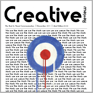
This is my final illustrated image for my front cover.


I tried experimenting with what could go on the front cover with the image as there was a lot of plain space so I placed repetitive text behind the symbol which says " We are the mods we are the Mods we are we are we are the Mods" this quote is very common between Mods so its highly relevant to the symbol and the Mod culture overall.


This is my final design for my front cover with the Mod symbol on the front. The reason for putting the paint drips on the image was to simply give the visual communication that the mods are fading away and thats the impression i wanted to give. Many people know what his symbol is and its very iconic thats why I chose it for the front cover of my magazine, this also gives some flow between the pages and some relevance to all the imagery and colour used in my designs.

Monday 21 November 2011

Creative Review Research and visual communication

What is Creative Review? ( Leading magazine for visual communication )


Creative review was first launched 32 years ago and has readers online in over 120 countries.
The aim of creative review is to give your average designer some insight as to what is out there and how far visual communication goes. This magazine is relevant to those in graphic design, advertising, digital media, illustration, photography and any other fields where visual communication may occur .


What is Visual Communication?


Visual communication from theory to practise - I found this book very resourceful and it also gave me a more in depth explanation to visual communication than I already knew. A point I took from the book was " why focus on an audience? ". Aiming a design at a mass audience is very easy as what is produced is subjective but by narrowing your audience it makes sure that the message you are trying to portray gets through without being questioned and only your audience then will really take interest to your design which is what I would be trying to do. This is a prime example as to why it is very important to understand your audience because if you try to guess or ignore the tastes of your audience the outcome will be disastrous.


Visual communication can also be very simple, for example type is a very simple way to portray various types of communication. Type is relevant in brands and logo's - every company will have some form of visual communication and the way they have been designed as this will effect their audience.


The visual communication from theory to practise book also talks about how the visual communication of the page layout for the " Wall street " newspaper, which allows the typical busy life of a business man to be able to read for short amounts of time but still take in a lot of information. The simple tabloid papers on the other hand are aimed at people who have a little spare time on their hands - people who will sit for a while to read the newspaper, so the front covers have simple yet jaw dropping headlines. These headlines are aimed so that when you look at them your interested as to what has happened.


Visual communication even occurs in products - energy drinks are a prime example of this as the typical colours used are blue, red and silver. In this case cliches aren't always a bad thing as trying to stay original risks confusing busy shoppers and confounding their expectations . Another example at visual communication is Tesco's value food, the packaging on their products are most of the time blue and white - this really does give the cheap feel to them and makes it easier to find their products so the visual communication of the packaging is aimed at people who want a cheap shop.


The book also cleverly indicates that if your visual communication is weak then people will have various ideas and views on what it is that they are looking at. If you want a design to portray an image aimed at a certain audience then it is important to make it clear for example; picture an image of a house at night  and you are standing about ten meters from it and only one light is on, your initial message is to portray that someone has burgled this house, now, any other person looking at that image may think differently for example someone else might think that its a welcome to a warm cozy looking home, another might think that someone is up late and watching television.


Visual communication is even relevant to the Mod culture, the clothes they wore are a form of visual communication. Someone living in the 60's would be able to tell what type of person someone is by the clothes they wore. If a person had a parka jacket on and a Fred Perry Polo with a pair of Levis, they would be able to recognise straight away that this person was a Mod, same way if a man had a Moss suit on you would know he has money, and then you could probably guess that he has a good job and is a wealthy man. To me in a nutshell visual communication is the visual aspects in which something portrays and what you gather from it at a first glance.


Creative Review previous front covers.


These are some existing Creative Review covers from previous months. What I like about these front covers is how they are all very different. However what they all have in common is that there is some form of space which allows the front page to be able to breathe. What Creative Reviews do, is incorporate their magazine heading " Creative Review " into suiting how the design is on the front of the cover. As I have to create the front page from scratch I need to consider how the type and colours used relate to my Mod theme. Possibilities of type would be type from the 60's period, or it may even be type that gives off a visual language that vaguely describes the Mod Culture, but at the same time I need to keep the visuals somewhat similar to those styles in the current creative review magazines. I also believe the front illustration on the front cover has to compliment the head and work along side it, things that effect this can possibly be the colour and arrangement - these simple adjustments can help the image to work with the header.


Creative Review Type Tryouts ( www.dafont.com )


Here are some typefaces I found that I think would suit the Mod theme and work well on the Creative Review cover. The first font is one that I found from Dafont.com, the name of the font is " Modern Conformist ". What I like about this typeface is that it has a sort of  Mod type look and a rough feel to it. This typeface when I look at it gives me the feel that its not going by the rules and where parts of the typeface are broken insists its not perfect just like what a Mod is. I could also see this typeface working well on a front cover - even with the parts of the typeface missing, as humans only need the top half of text to be able to read it.

The second typeface is called Moderna and is also from Dafont.com - what I like about this typeface is the whole rounded effect, this straight away comply's with the Mod roundel symbol. This typeface could work really well along side that image. Even if the image wasn't used with the roundel, by simply changing the colour on the typeface it could easily give the exact same effect. This is my favourite out of the other 3 typefaces because it also has a 60's feel to it which would work well with other images I may consider to have on the front page of my magazine.

The third typeface is called LL Rubber Grotesque. What I like about this typeface as far as visual language is concerned, the feel this type gives off is again rough around the edges and cool and that its not going by the rules. Mods were far from your law abiding citizens, they took drugs and had fights, this made the public view them as people who they dont want to be associated with and I think this typeface really conveys that message across.

The 4th typeface is your normal standard Gill sans. The reason for choosing this as an appropriate typeface was because in the 60's this was a popular type, its quite a neutral typeface and would work well on the cover of a magazine but it does not really convey any message of any kind. The typeface used on the front cover I believe has to convey a message as it will help give the Mod feel to the magazine.


My Creative Review Front Page Templates


This was a front cover template I came up with - basing this on my research of previous creative review issues this was very similar to their current design, this design acts as a header for the magazine and has some basic information such as the issue it is ( Visual Communication ), the month of the issue and also what edition it is. Although the design is very basic I think its very effective as it leaves a lot of breathing space for the illustration. Also I found that with creative review front covers the header is very minimalist and that its the front page image that gives the cover its wow factor.


This design is very similar to the one above but this was a matter of rearranging the text to compliment the front page more. I think having the design this way suits better as the creative review is more dominant; when people first look at the front page they will automatically look at the main image but the name of the magazine has to also be dominant so that the person looking knows what magazine it is for.


This was another idea different to those above this design gives the page less breathing space but at the same time it makes the magazine name more dominant. The placement of my illustration would have to change as it has to compliment how the header is placed.
A problem with having the design like this, is that my illustration will fill the whole front cover so the colour of " Creative " and the other type will have to remain black as this might effect the readability.


Creative Review Page Layouts


The Creative Review page layout is all about the imagery and then how the type fills around these images. Images fill most of the pages in creative review and this is what gives the page its feel and what its all about . Although type isn't as dominant as the imagery, the placement is as just important as it compliments the imagery and makes the page more design filled, analysing these pages have given me an insight as to how the various creative review pages compliment each other. The layout of the text is always done in collumns sometimes 4 to a page.


Page Layout Ideas


This was an indesign document I made in class - the main feature on the page is the text wrap around an image. I think this simple method is highly effective as it makes the page look more design filled and makes it look more attractive; this is a method I could possibly use in my page layout design.


This was another design idea I had for one side of the page spread; although its highly text orientated the simple text wrap on the " We are the Mods " is very effective, this also gives immediate indication as to what the page is about without any imagery. This was done by simply using the pen tool to draw around the text and then using the text wrap tool this makes the text wrap around the pen tool line and not go into the area within the pen line.


Another method to use on a page spread is a drop cap; this makes type look more appealing to read than your standard type - having a drop cap enlarges the first letter of a paragraph making the text stand out more.  A drop cap on text entices the person looking at the page to read the text, most people if they aren't generally interested wont read text if its really bland but the drop cap makes it more interesting to look at and will make the viewer more inclined to read it.


This is going to be one of the main text phrases used in my double page spread. It is a well known phrase to Mods " We are the Mods we are the Mods we are we are we are the Mods " - this symbolised that Mods were proud of who they are, I think to too many people this will make the page interesting and eye catching.


Mod Culture


What is a Mod? Mod is a subculture which first started in England in the late 1950's, a Mod during this era was a young working class youth. Mods carried an image of being stuck up and emulating the middle class, reason for this is that being a Mod was meant to be portrayed as something that was better than all the other subcultures such as  the Rockers, Skinheads, Punks and Teddy Boys . Quotes like " We are the Mods we are the Mods we are we are we are the Mods " signified that they were proud of what they were. Being a Mod was a chance to be different and stand out from the crowd and be noticed for being different to your "normal" person. Groups evolved from being a Mod, people that found the same interests and wore the same clothes naturally got along with each other and in some cases they may even have considered to be a gang.


http://www.stthomasu.ca/~pmccorm/modsandrockers2.html


Quadrophenia Film - 1979


This film is about a working class boy named Jimmy who hates his normal life, only when he's with his friends who are a part of the Mod culture he feels free and accepted. He feels life cant get any better taking drugs and scooter riding with friends. He attends a Brighton scooter run where both Mods and Rockers attend which ends in both cultures battling for in my opinion supremacy. Jimmy's life begins to spiral downwards and begins a path of paranoia and isolation.


http://www.imdb.com/title/tt0079766/plotsummary


I thought the film really portrayed in depth what is was to be a Mod, the film had every detail and really gave me an insight into the Mod culture. There was a lot more than just being a Mod - it was the image and person you were that also makes you that, within the Mod culture tight friends were made and it was all about standing up for one and other, sharing the same interests is what made the Mod culture so big, wearing the same clothes, listening to the same music and even the way they spoke. Main points I took from the film that seemed the most significant for the time period and which things make the culture what it was are:


  • Scooters
  • Drugs
  • Music
  • Clothes


Scooters

Being a Mod a scooter was a must have object, Lambretta and Vespa were the most common types of scooters for Mods to have, this was apart of their stigma which connected them to being a Mod, anyone during this time period can buy a scooter but what the Mods did was customise their scooters to give them the " Mod Look " this gave the scooters a really unique and over the top look, this backs up the point made that a Mod is slightly up themselves and didn't care what other people thought. Scooters helped Mods to stand out as when they travelled in large groups to places like Brighton - they were easily noticed and were pointed out as the Mods.

Even today there are Mod clubs and reunions where large groups of Mods or Ex mods gather at bars pubs etc and have rallies to places such as Southend, Isle of Wight and to the coasts up north. This means that even today the Mod culture is still alive and people still keep the flame alight with all the stigmas that signify what being a Mod was all about.


Drugs


Drugs played a major part in the Mod culture, large amounts of money was spent on drugs in the late 1950's. These were mostly consumed when Mods were out clubbing and partying. Drug crime didn't really happen during this era as drugs were shared amongst the groups, compared to now drugs are one of the major problems in crime and cost the Government millions of pounds every year. Mods being mostly young - under the age of 30, drugs and smoking cigarettes was viewed as being cool. 


A popular cigarette in the 60's was Camel. Camels advertising was all about how cool it was to smoke, they would have various headings which all in one way shape or form said to smoke Camel cigarettes because there the best.


" Every inch a real smoke " this insists that the whole cigarette is 100% real compared to other cigarette brands you wont get one like Camel.


" Camels real taste satisfies longer! " Again imply's that other cigarettes dont satisfy like Camel cigarettes do.


When Camel started advertising in magazines they cleverly used images of the younger generation, this sends a whole new message that smoking among young people is cool, and the type of people shown in the image are all dressed as if they have come from a party which again applies another message that smoking when your out and with your friends is a good thing to do.


Again another image with a cool looking person on it and the Phrase " One of a kind " Camels advertising just signify's that there cigarettes are the best.


Again another image similar to the one above but these images portray a character of someone who would be considered to be good looking, down with the girls and popular. The guy in the images also smokes Camel cigarettes which tells the viewer that if you smoke these cigarettes you will become popular and "get with the girls". The younger generation would have been considered to be naive so these sorts of advertisements are highly effective.


Music


Ready Steady Go! This was a new television show in the 1960's. Music was rapidly growing within cultures - producers were thinking of a way to cover music, fashion and celebrity talks in a new current way. ABC Television came up with a new way for youths of this time period to be up to date with the latest trends, music and celebrity happenings. The scene of the television show had a slight chaotic feel to it with dancers close to the acts, performances and interviews but at the same time it was very appealing because there was so much going on. On Friday nights " The weekend starts here " was on the ABC television station which had 30 minutes of live music performances from all the latest and most popular bands.


http://www.screenonline.org.uk/tv/id/561858/index.html


The Who ( Popular band within the Mod culture )


The Who was a band in which between 1968 and 1975 were most popular and one of the most influential groups at its time, the band received a lot of criticism from the public and they were taken less seriously compared to the music of the Beatles and the Rolling Stones. In the space of those 6 years people of the public said that their individual personalities were are recognisable as members from the Beatles.


http://theband.hiof.no/history/band_shortstory.html


The Kinks ( Popular band for a short time within the Mod culture )


Again another band popular within the Mod culture which were popular around the late 1960's. The Kinks began as an R&B/Blues genre which was big in England at the time but after 4 years the group slowly drifted from all its other competitors and began to draw heavily away from British music.


Ska Music 


Ska music was a genre of music which is a form of blending Jamaican Music like calypso and jazz. Early Ska music was first known in America in 1964 and thanks to the television show " Ready Steady Go " people in the UK were able to hear these sorts of songs. Ska music was not as popular as it was in the late 1970's and the early 1980's this was the era of the Mod revival. The film Quadrophenia being made in 1979 had Ska genre songs from bands such as The specials, Madness and The Beat. 


http://www.wisegeek.com/what-is-ska.htm


Music within the Mod culture is what separated them from all the other sub cultures, people who liked Ska music and the various bands shown above would automatically go into the Mod culture. If someone liked Rock music they would be a Rocker. After watching the movie Quadrophenia Mods used to shout aloud the lyrics from songs to almost taunt other cultures as they know which bands were connected with which culture. For example in the movie the Mods are attending a party when someone changes the record player and all the Mods started dancing then some people who wasn't part of that culture left the house as they felt segregated.


Mod Fashion


Mods were obsessed with fashion they always wanted the right look and style. They spent small fortunes on tailor made suits, shirts and shoes. Mods found tailors in south and east London who could make a suit from drawings supplied. There was a strong Jewish feel within the Mod culture as many Jewish boys had fathers in the rag trade so naturally grew up with an interest for clothes. They also knew the best places in London to get high quality suits, this is what made Mod a middle class as well as a working class cult.
1964 was the first year in which Mods became noticed they clashed with a rival group called the Rockers. The Rockers preferred leather jackets, motor bikes and traditional Rock'n'Roll. The first clashes between the two cults began in Clacton and spread to places like Hastings and Brighton as shown in the Quadrophenia Film.


Fred Perry 


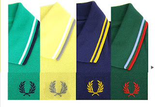
The Fred perry polo shirt was very popular amongst Mods in the 60's. The line of clothing was intentionally aimed for tennis wear and was only available in white, but, with Fred Perry growing bigger and bigger within the Mod culture they demanded a greater selection of colours. These polo's were worn as casual wear with jeans or could even be worn under a suit. Fred Perry polo's are still worn today and are available in hundreds of different styles. Mod culture is what made Fred Perry's polo's so big as there line of clothes were made for tennis, and now they are worn as casual and smart wear, this is where the style of Mods are still occurring today.


http://www.retrowow.co.uk/retro_style/60s/60s_mods.html


 Ben Sherman 


Ben Sherman was another brand of clothing that Mods wore - but within this brand Mods only wore the shirts. The Ben Sherman shirt had a buttoned down collar with an additional button at the back and also a hanging loop sewn into the shirt. Ben Sherman's were sold at John Stephan and Lord John on Carnaby Street in the 60's. Some of these shirts were even worn by people who were in Mod bands - this is what made Ben Sherman shirts also popular for its time.


http://www.retrowow.co.uk/retro_style/60s/60s_mods.html


Mod's battle over RAF symbol


Clothing Giant Arcadia group is in talks with the Ministry of Defence over the rights of the use of the blue white and red target symbol. The fashion group claims that the roundel was brought into public use by the Mod movement in the 1960's. Arcadia Group who own Dorothy Perkins, Topshop and Burton, also say they are going to help other clothing manufacturers such as Lambretta and Ben Sherman who have also used the symbol on their products.


A spokesman for Arcadia group said ; " The roundel has been in public use since the 1960's, when it was closely associated with the style of dress made famous by the Mod movement, riders of scooters bearing a plethora of lights and mirrors, wearers of fish-tailed parkas and the musical band The who ". I found this to be quite interesting as I didn't actually know what the symbol was, or about. Its first use was in the 1960's with clothing that was Mod orientated. This was a great symbol for the Mods and is what labeled them - this was the most symbolic figure used to signify a mod as in the movie Quadrophenia this symbol was found on scooters.


http://news.bbc.co.uk/1/hi/england/3222616.stm


google.com/imagesmod


Parka Jacket


The rise of the parka jacket happened in the 1960's and this was partly because of its practicality, cheapness and availability. The coat was the ideal garment when riding on a scooter or on your way to a club, as it made it easy to gather what cult you were from. The parka jacket has its history which was made from the newspaper picture with the heading " Parka Clad" during the 60's bank holiday riots - even today the jacket is still a symbol of the Mod culture scene.


google.com/imagesgirl.phpmod


Girls who were mods looked like boys most of the time, they wore the same clothing as what male Mods wore and would cut their hair short. The 60's was the first time where women started wearing clothes that showed some flesh and also makeup started becoming more popular. Women within the Mod culture had eye liner flicks and used to wear 60's shift dresses and Fred Perry Polo's and for footwear they wore square toed heels and chelsea boots.


http://answers.yahoo.com/question/index?qid=20090612033243AA7qWjb